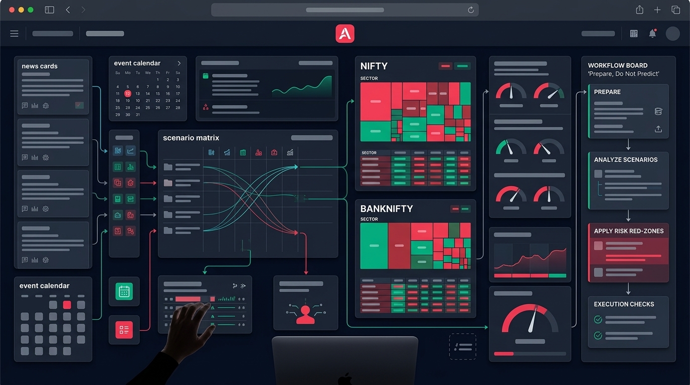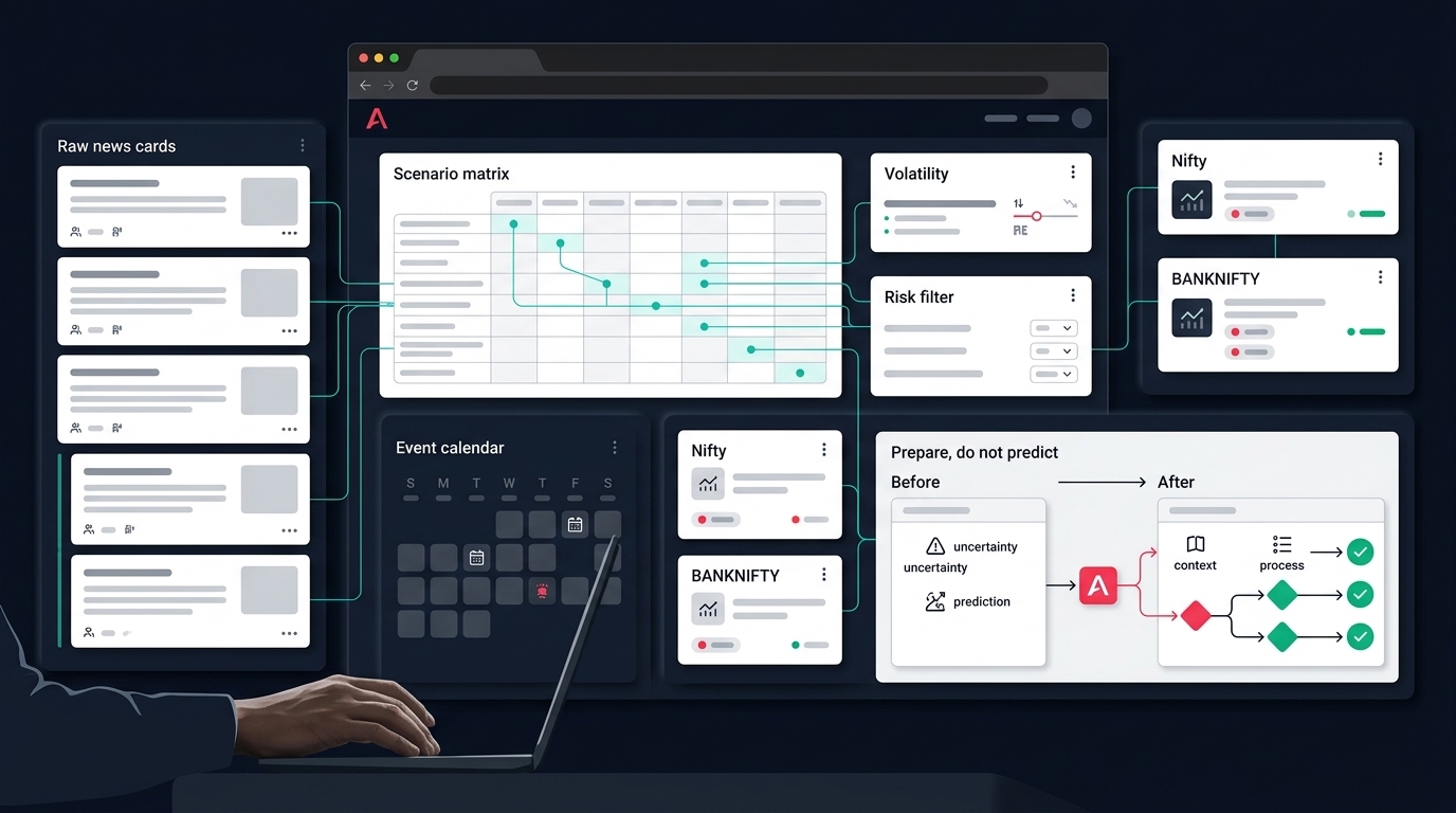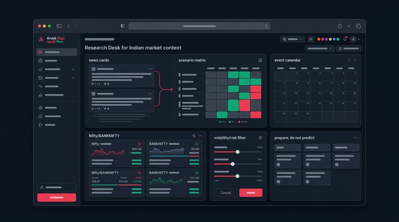
Open any market dashboard this weekend — September 13, 2026 — and you will see the same story told in coloured tiles. Which NSE sectors led the week. Which lagged. A rotation map claiming to show "where the money is moving." One widely followed rotation tracker went into this weekend ranking pharma at the top, with 95% of its pharma setups marked bullish and the sector up 9.7% against the Nifty over three months. Metals and chemicals sat close behind. Somewhere lower down, a small sector showed "100% setups bullish" — built from exactly two setups.
That last detail is the whole problem with how retail traders consume sector data. The heatmap is real. The colours are accurate. And the conclusions people draw from them are often statistically meaningless.
This post is about reading sector rotation and market breadth the way an algo trader should: as context that changes your risk posture, not as a signal that picks your trades. Heatmap dekh ke Monday morning entry lena is not a strategy — it is a mood. Let's build the process version instead.
What a Sector Rotation Dashboard Is Actually Telling You
Most Indian sector dashboards — and there are now several good free ones that recalculate every evening after NSE close — combine four kinds of information:
Rotation state. Sectors get classified as Leading, Improving, Weakening, or Lagging, usually based on relative strength versus a broad benchmark like the Nifty 500 and the momentum of that relative strength. Pharma outperforming the Nifty by 9.7% over three months while its rank improves is a "Leading" profile. A sector that is still outperforming but decelerating is "Weakening."
Breadth inside the sector. What percentage of the sector's stocks are above their 20-day or 50-day moving averages, how many are making new highs, how many setups a scanner finds bullish versus bearish.
Rank movement. Day-over-day changes — a sector moving from #4 to #3, another slipping from #3 to #4. This is the part traders overweight the most and the part that means the least on any single day.
Market-level breadth. Advance-decline counts, percentage of the full universe above key moving averages, new 52-week highs versus lows, India VIX. This is the health check for the whole tape, and it matters more than any individual sector tile.
Everything above is computed after the close. It is descriptive. Nothing in it tells you what Monday will do — it tells you what kind of market you were in through Friday, which is genuinely useful if you treat it that way.
Four Ways Rotation Data Fools Disciplined Traders
Trap 1: Yesterday's rank is already history
Rotation rankings churn. A sector that moved from #8 to #7 today can move back tomorrow. If your response to every rank change is to re-point your scanner at the new leader, you are effectively running a strategy that buys strength one day after it printed — with no backtest behind it.
The fix is to act on persistent states, not daily flips. A sector that has been in the Leading quadrant for three weeks is a different fact from a sector that entered it yesterday. If your rules care about sector leadership at all, define the minimum persistence — for example, "leading for at least five consecutive sessions" — and write it down before Monday, not during it.
Trap 2: Percentages built on tiny samples
"100% setups bullish" sounds like the strongest signal on the page. Then you read the fine print: two setups, one breakout. A sector with 21 setups and 95% bullish is telling you something about participation. A sector with 2 setups is telling you it has two liquid stocks doing something, which is not a sector story at all.
Algo traders should be allergic to this. Any percentage without its denominator is noise. When you log sector stats for your own process, log the counts, not just the ratios, and set a floor — for instance, ignore sector-level readings built on fewer than 8-10 constituent setups.
Trap 3: The sector index hides stock dispersion
A sector index up 1.2% can mean twelve stocks up moderately, or two heavyweights up 4% while the rest bleed. These are different markets for a stock scanner. The first supports continuation setups across the sector; the second means your scanner hits in that sector are riding one or two names' momentum, and the "sector confirmation" you think you have does not exist.
This is why breadth-within-sector matters more than the sector's price change. Before treating a sector as supportive context, check that the percentage of its stocks above their short-term averages actually agrees with the index move.
Trap 4: Narrow leadership dressed as market strength
The classic Indian version: banking heavyweights carry the Nifty higher while advance-decline is negative and mid-caps drift lower. The index chart looks fine. The tape underneath is not. As one breadth-focused dashboard puts it, a 100-point rally carried by three heavyweights and a 100-point rally carried by 800 advancing stocks look identical on a price chart — and behave completely differently afterwards.
For an algo trader, narrow leadership is not a prediction of a fall. It is a regime label: follow-through on breakout systems tends to be less reliable when participation is thin, so it is a reasonable trigger for tighter risk, not for directional bets.
Turning Rotation Context Into Risk Filters, Not Entry Signals
Here is the practical shift: sector and breadth data should change how much you let your systems do, not what they trade. That keeps the discretion at the risk layer, where it belongs, and leaves entries fully rule-based.
Four filters worth defining explicitly:
A regime tag you compute the same way every day. Something as simple as: broad participation (most sectors green, advance-decline positive, healthy percentage of stocks above the 20-DMA), narrow leadership (index up, breadth flat or negative), or broad weakness. Three states, written criteria, logged daily. Your risk management rules can then reference the tag — for example, normal position count in broad participation, reduced count and wider stop review in narrow leadership.
A sector alignment check on scanner output. When your scanner fires a long continuation setup, the question is not "is this stock strong?" — the scanner already answered that. The question is whether the stock's sector is at least neutral. A long breakout in a sector that has been in the Lagging quadrant for weeks is fighting the rotation; you can still allow it, but it should be a conscious, logged exception rather than a default.
Exposure caps by sector. If pharma is leading, a momentum scanner will naturally surface many pharma names. Without a cap you can end up with five open positions that are really one trade — a single sector bet with correlated gap risk. A rule like "maximum two concurrent positions per sector" is boring and effective.
Event and flow awareness, not event trading. Some sectors are more sensitive to FII flows, rates, and currency; banking and IT react to different macro inputs than pharma or FMCG. You do not need to model this. You need to know when a rate decision, expiry week, or major sector-specific event sits on the calendar, and decide in advance whether your systems trade through it or stand down. That decision belongs in a weekly review — our weekly market outlook approach exists for exactly this: use context to prepare, not to chase.
A Weekend-to-Monday Process
September 13 is a Sunday, which makes this concrete. Friday's data is final, nothing will change until Monday's open, and you have time to do this properly. A workable sequence:
- Snapshot the rotation table. Note the top three and bottom three sectors, their rotation state, and — critically — how long each has held that state. Persistence over position.
- Snapshot market breadth. Advance-decline for the week, percentage of the universe above the 20-DMA and 50-DMA, new highs versus new lows, India VIX level and direction. Five numbers, two minutes.
- Mark the divergences. Index versus breadth. Sector index moves versus sector-internal breadth. Anything where the headline and the internals disagree goes on a watch note.
- Reconcile with your open positions. Which sectors are you already exposed to? If your book is concentrated in a sector that just slipped from Leading to Weakening, that is a risk-review item for Monday — not an automatic exit, a review.
- Set Monday's regime tag provisionally and write down what would change it intraday (for example, a sharply negative advance-decline in the first hour).
- Check the event calendar for the week and mark any sessions your systems should skip or trade at reduced size.
The output of all this is small: a regime tag, a sector exposure note, and one or two written exceptions. That is the point. Context work should compress into a few parameters your rules can actually use.
What to Log So You Can Backtest the Filter Later
Every filter above is a hypothesis until you test it. The trap is that sector-regime data is easy to look at and hard to reconstruct later — most dashboards show today, not a queryable history. So build your own log from day one.
Daily, log: your regime tag, the breadth numbers behind it, each sector's rotation state and rank, and — for every trade your system took — the sector and the regime tag at entry. After a few months you can answer real questions: do your breakout trades actually perform worse under the narrow-leadership tag? Do longs in Lagging sectors underperform longs in Leading sectors by enough to justify the filter? Sometimes the honest answer is no, and you delete the filter. That is a good outcome too — it is one less discretionary knob.
This is the same discipline as any backtesting work: the filter earns its place with data, or it goes. If you build strategies in a no-code strategy builder, keep the sector filter as an explicit, versioned rule rather than a mental override, so the live behaviour matches what you test.
Where This Sits in an Anadi Workflow
Inside Anadi, this context-first sequence has a natural home. The Indices view carries index cards and a sector heatmap, and it is deliberately positioned as the step before acting on scanner or options setups — you check participation and sector alignment first, then look at individual signals. Action Center then does the narrowing: scanner candidates arrive ranked, with freshness, entry-quality, and blocked reasons (like chase distance or invalidated price) visible before any order exists, plus F&O context for eligible names. The sector heatmap tells you what kind of tape you are in; the blocked reasons stop you from expressing that context as a late, emotional entry.
If you want to run this kind of context-then-filter workflow end to end — heatmap, scanner, action queue, paper-first execution — you can request early access here.
Takeaway: The Sector Context Checklist
- Rotation dashboards are descriptive, not predictive. Use them to label the regime, never to pick Monday's trade.
- Trust persistence, not daily rank flips. A three-week leader and a one-day leader are different facts.
- Never read a percentage without its denominator. Two setups at "100% bullish" is not a sector signal.
- Check breadth inside the sector, not just the sector index move — dispersion hides behind averages.
- Narrow leadership is a risk-posture trigger: fewer positions, stricter entries — not a directional call.
- Cap concurrent positions per sector; correlated longs are one trade wearing five names.
- Log regime tags, breadth numbers, and per-trade sector context daily, so every filter can eventually be backtested — and deleted if it fails.
The heatmap will be a different set of colours next weekend. The process should look exactly the same.